It’s far more difficult to design a product, ad, or building than you might think. You could argue that human beings are innately artistic and love aesthetic, but the sad truth is that there are far. There are too many designs that fail. Thinking about them is both hilarious and frightening at the same time. The most powerful pics can haunt you for weeks or months at a time. Good design, why are you so rare?
Outline
One of the best places to find some outstanding examples of double-plus-ungood designs is the subreddit r/CrappyDesign which shames and pokes fun at them for our amusement. Have a look at some of the worst. Disasters that were featured recently.
1. Dexter’s gas station.
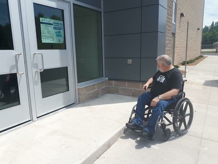
2. That step could be turned into a ramp in a day.
3. That looks pretty derp.
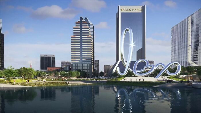
4. That picture is terrifying on all levels.
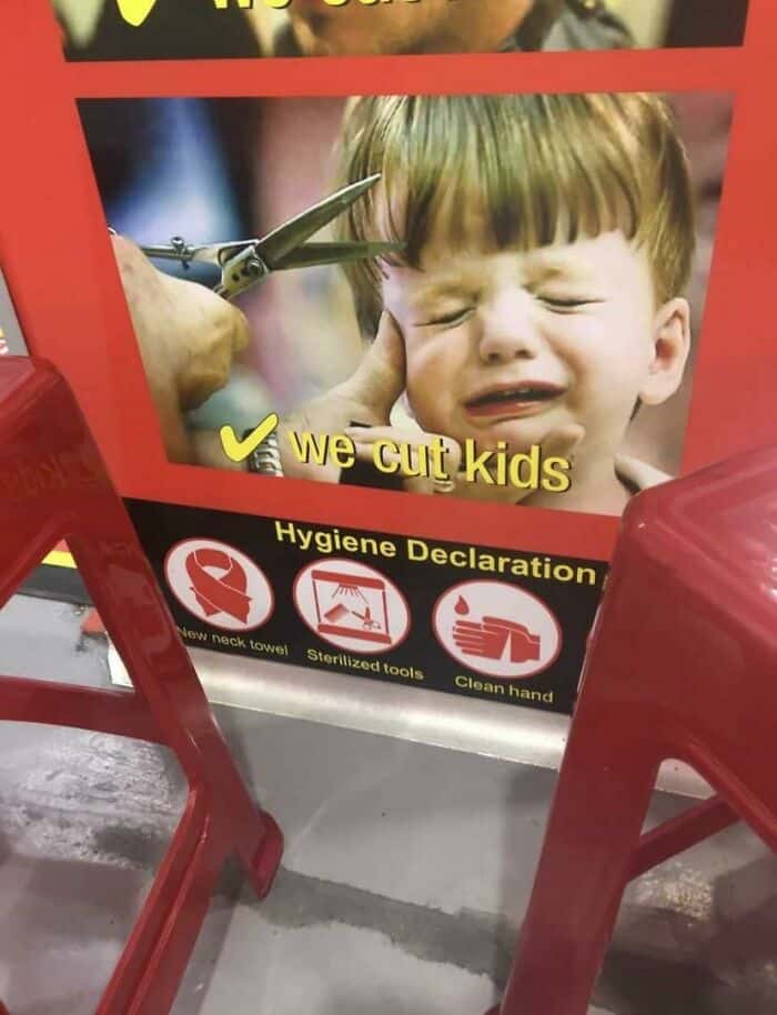
5. Password, please.
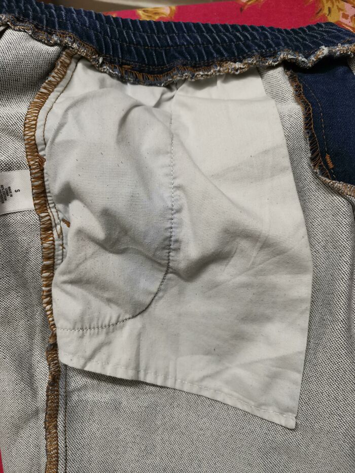
6. Someone really likes lawsuits in this hotel!
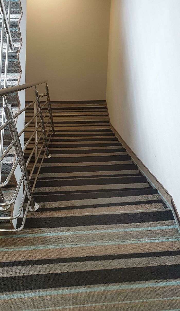
7. Blobfish baby.
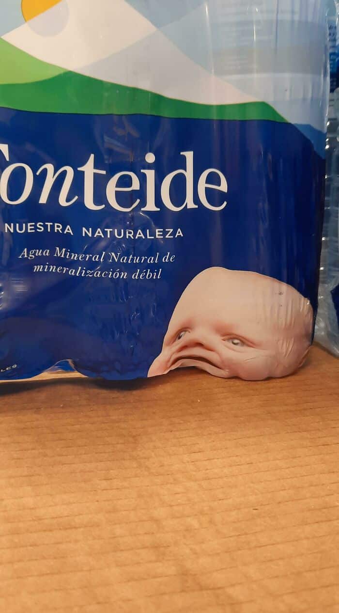
8. Someone watches too much cat p*rn.
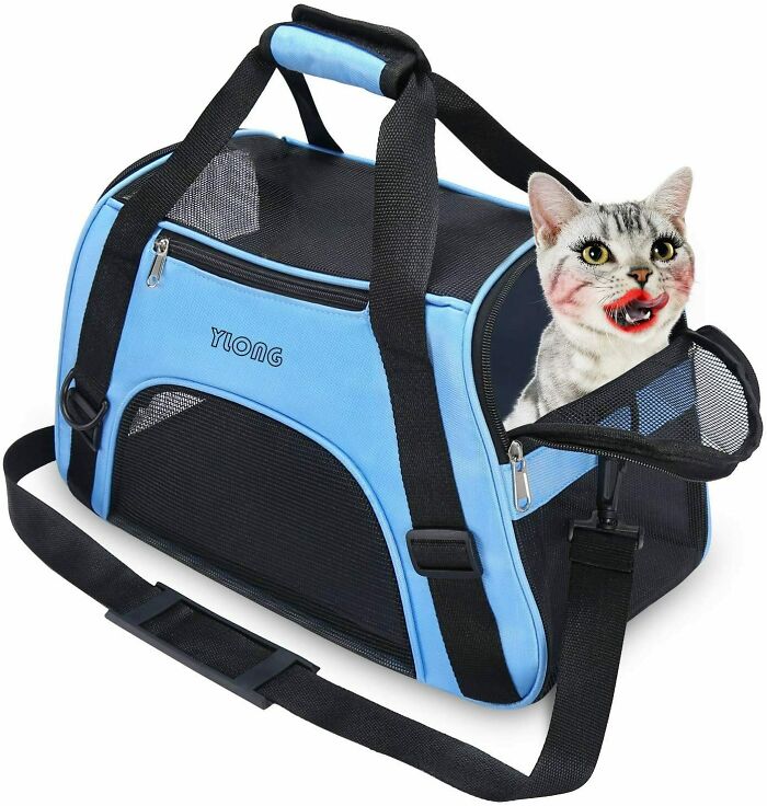
9. Just like cartoon bunnies.

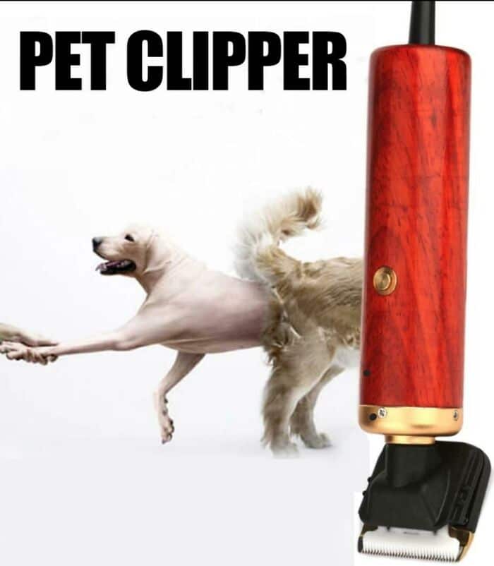
10. That’s one powerful dog peeler.
11. Made like this on purpose to keep the homeless from using it.
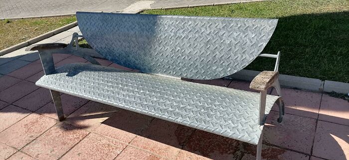
12. The person who designed that is evil and is sitting in a corner laughing.
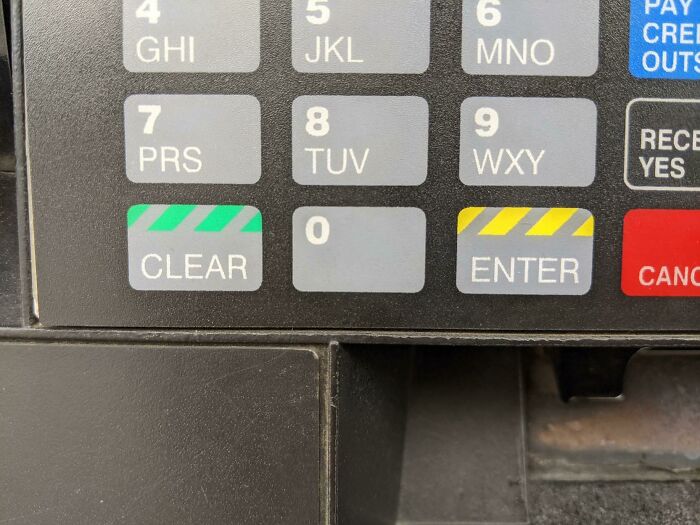
13. “Don’t pee against the wind”
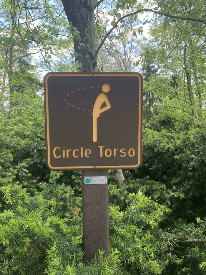
14. Well, that’s a step in the wrong direction.
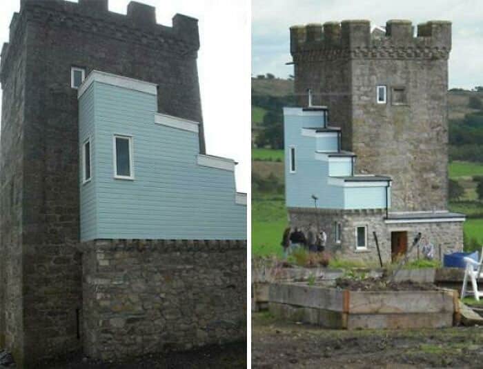
15. The donut puzzle piece is just a bad design on its own.
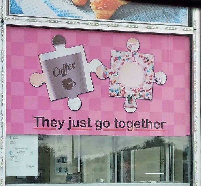
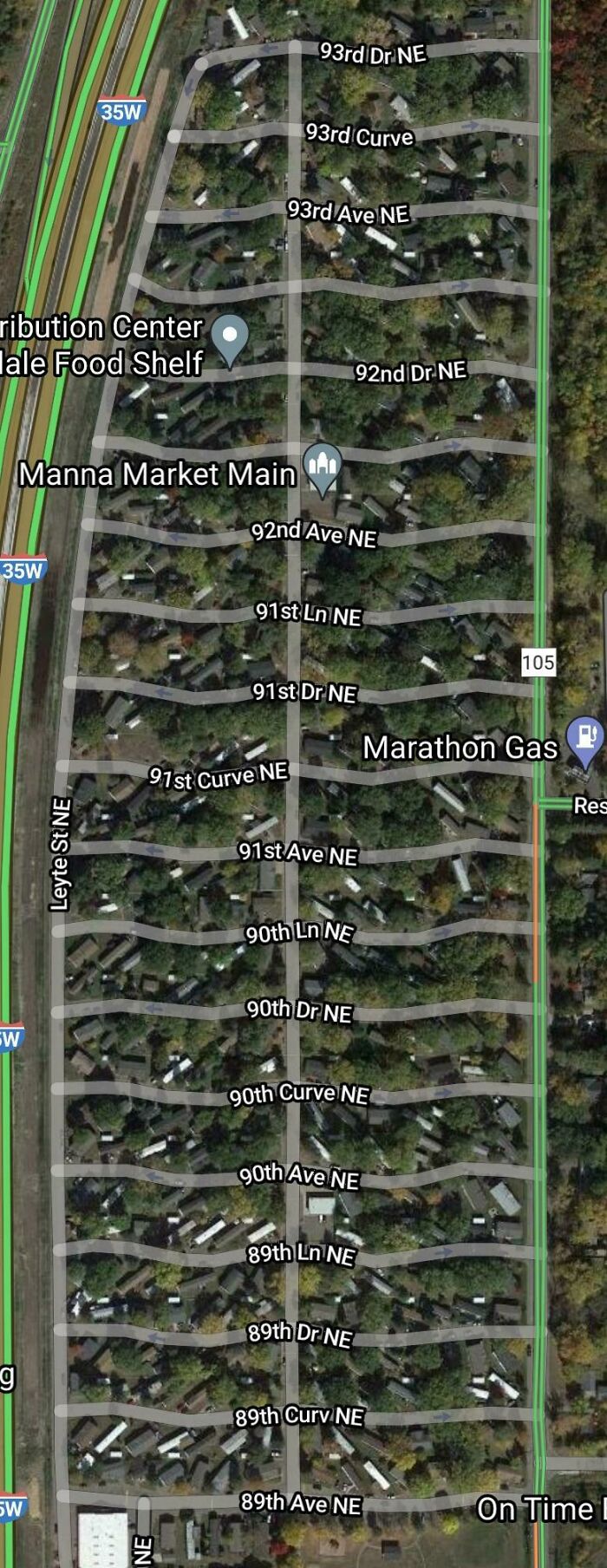
16. Did they ran out of street names?
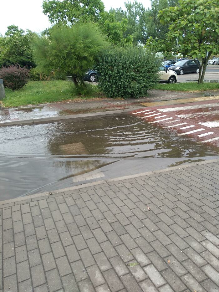
17. Automotive steeplechase?
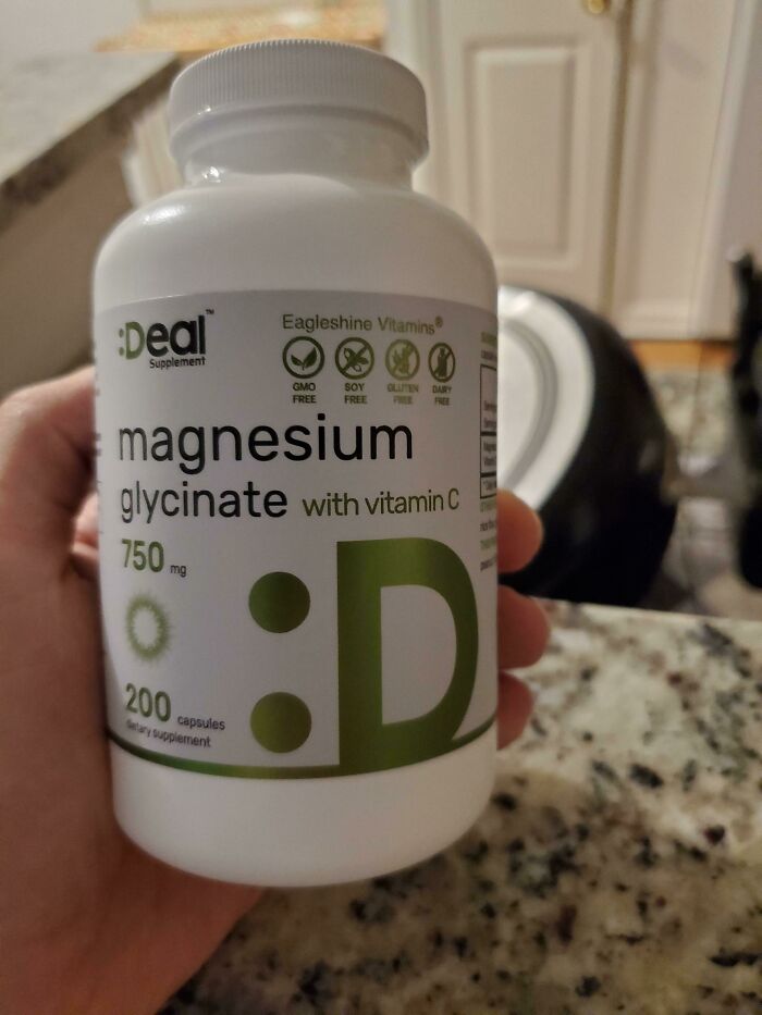
18. Technically, it’s an emoticon, not an emoji “:D”
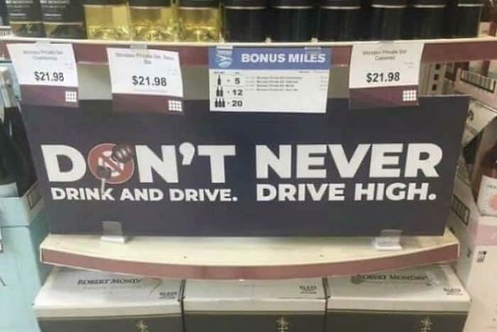
19. Don’t design signs when you’re drunk and high.
20. The design is just a stroke of genius.

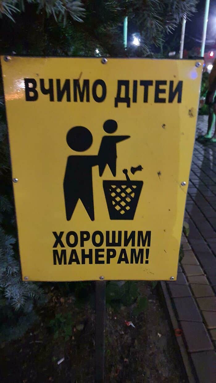
21. Looks like another baby is fighting to get out.
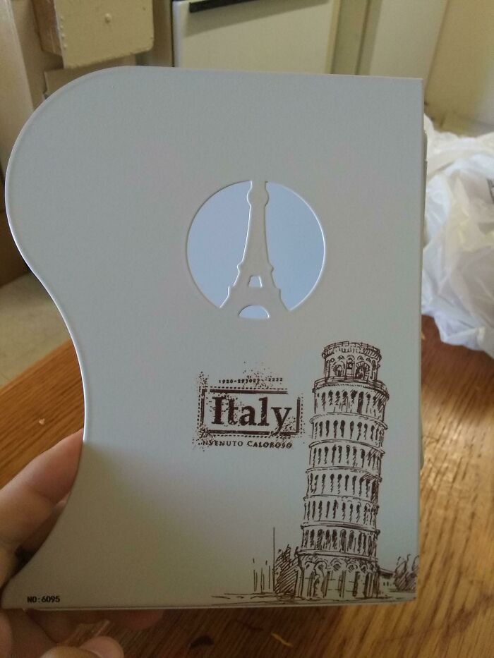
22. The Eiffel Tower of Pisa.
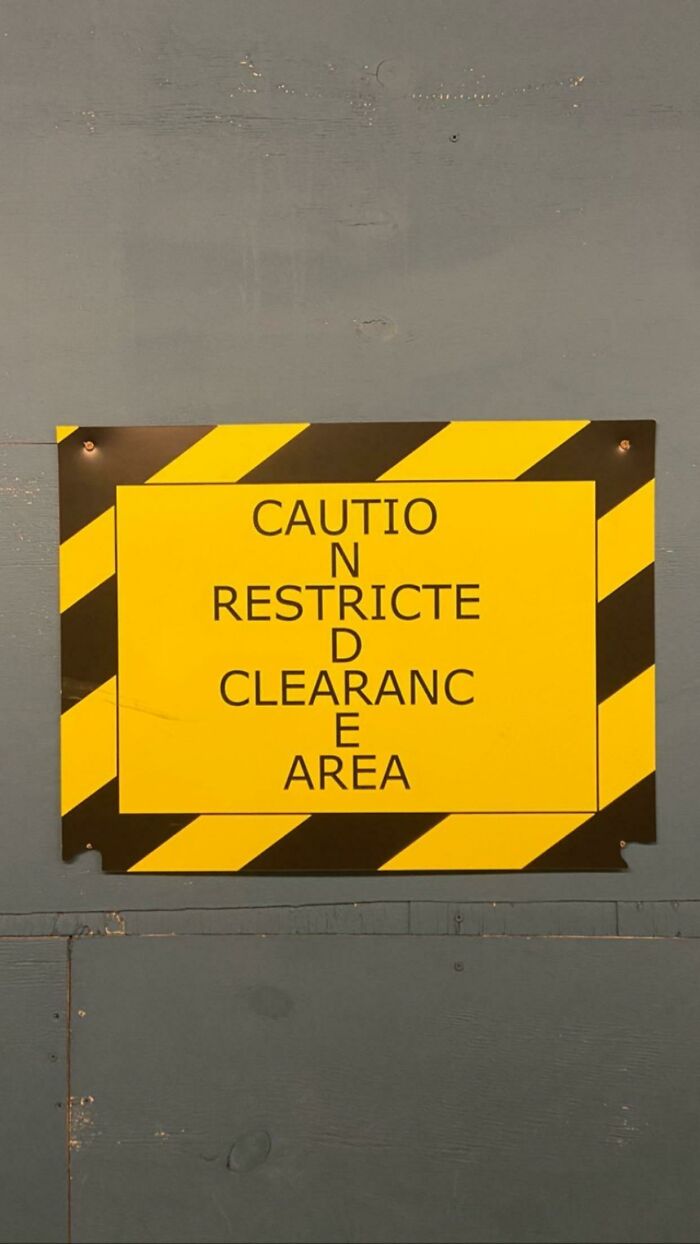
23. You had one job, Tom.
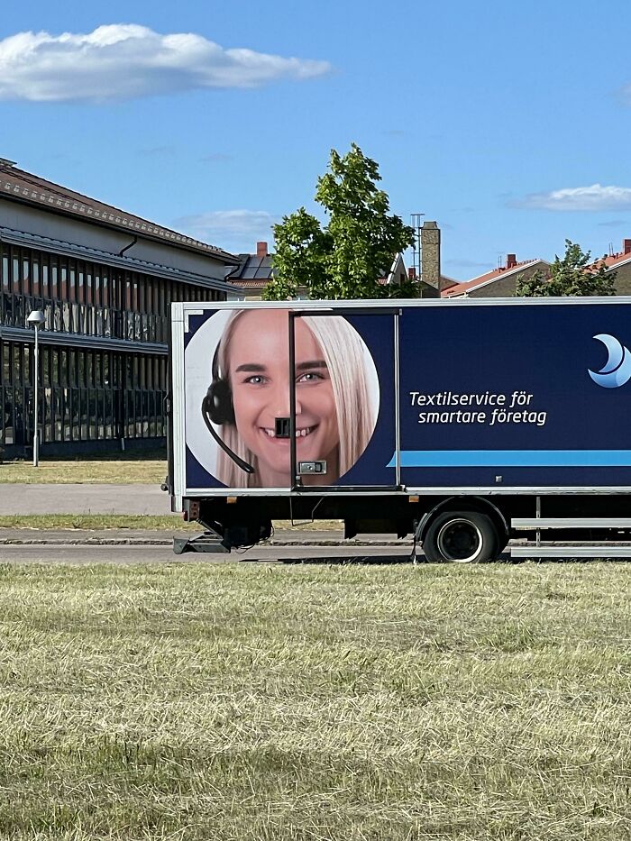
24. Hitlers sister.
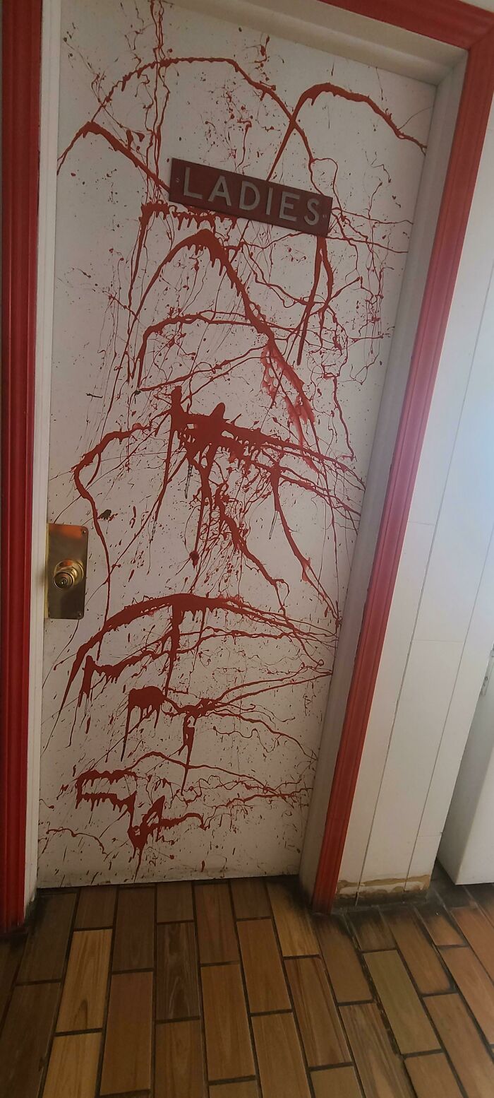
25. Is that the place with the blood splatter door?
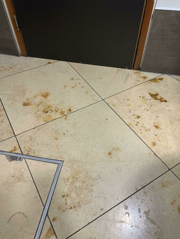
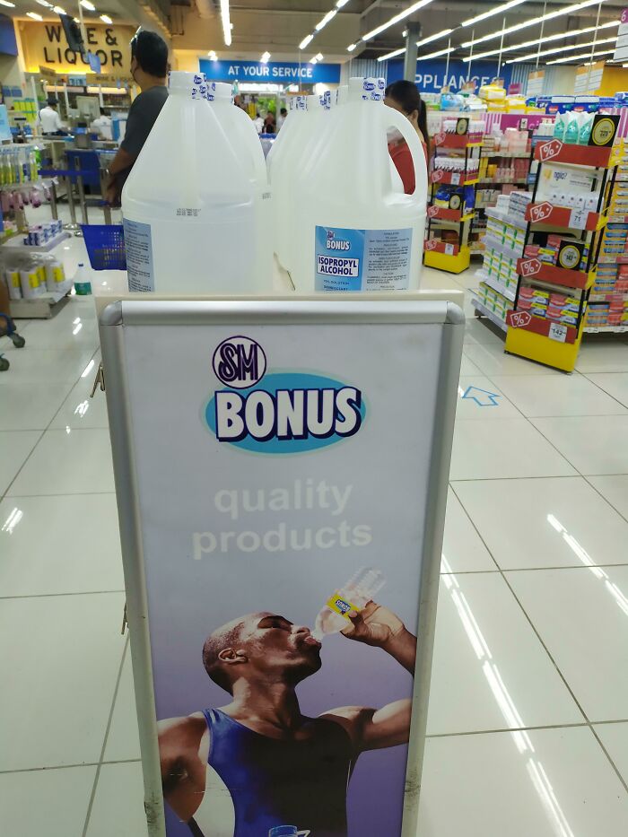
26. Free one-time trip to the hospital with each purchase.
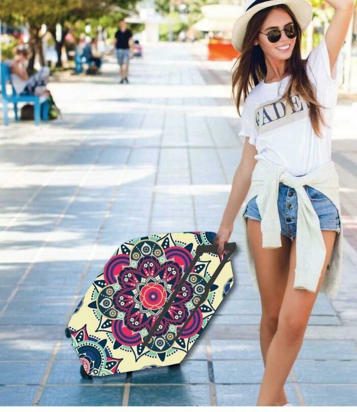
27. It’s a portal to another dimension, two-dimension.
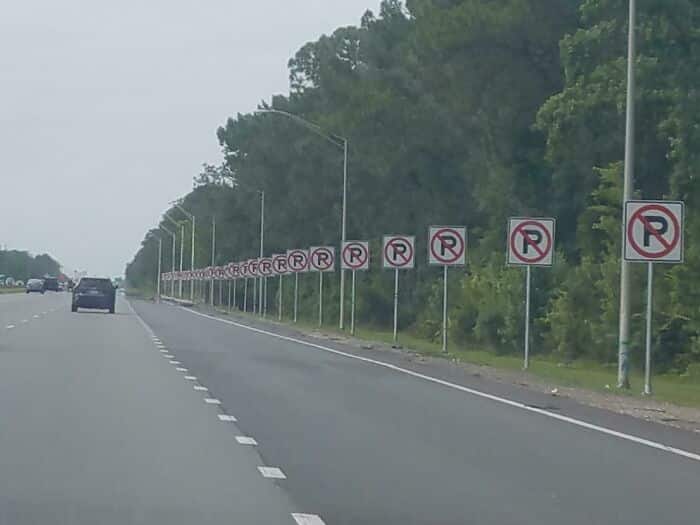
28. Whatever you do, don’t “P” here.
29. That’s just illogical overthinking.
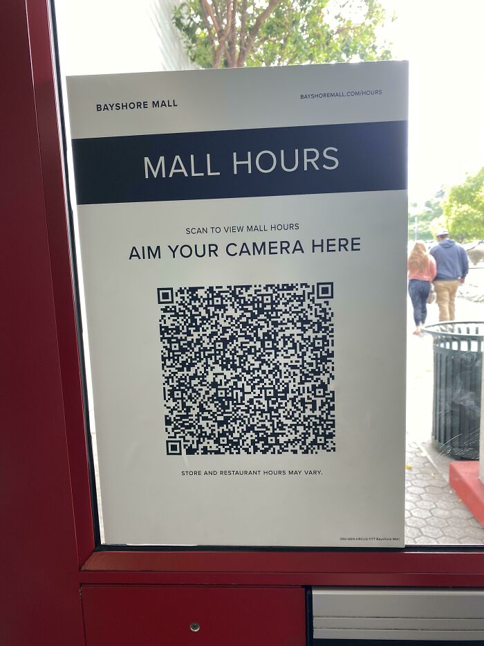
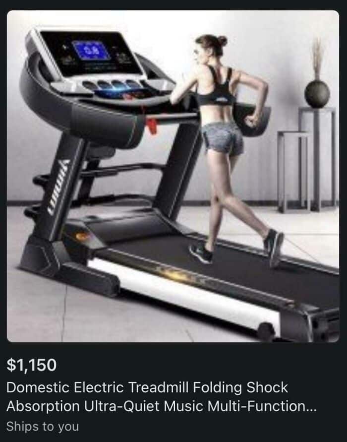
30. It’s not a giant treadmill, it’s just a tiny person!
