We’re featuring some of the best and brightest designs we’ve seen. Some of these are genius while others are so simple-but-effective that we’re sad we didn’t think of them first. Whatever the case, these designers truly push the boundaries of creativity with their imaginations.
Jessica Leigh Clark-Bojin, an incredibly skilled pie artist and the author of ‘Pies Are Awesome: The Definitive Pie Art Book,’ was kind enough to walk us through her thoughts on good design, creativity, motivation, the world of Pie Art, and how to balance the needs of the customer and audience with the desires of the artist. Scroll down to read her artistic insights.
#1 This Lamp Post Holds Up An Umbrella For A Spot On The Bench

We were interested to get pie artist Jessica’s take on how much designers and creatives should focus on the audience and end-users, and how much they should try to stay true to their artistic vision.
“I have a loose ‘three for them, one for me’ policy when it comes to my art. Riding emerging trends and tapping into the cultural zeitgeist certainly helps when you are trying to build a following. And as much as I would love to just make what I want all the time, my art puts food on the table (figuratively and literally), so I have to pay attention to what the people respond most to,” Jessica explained to us.
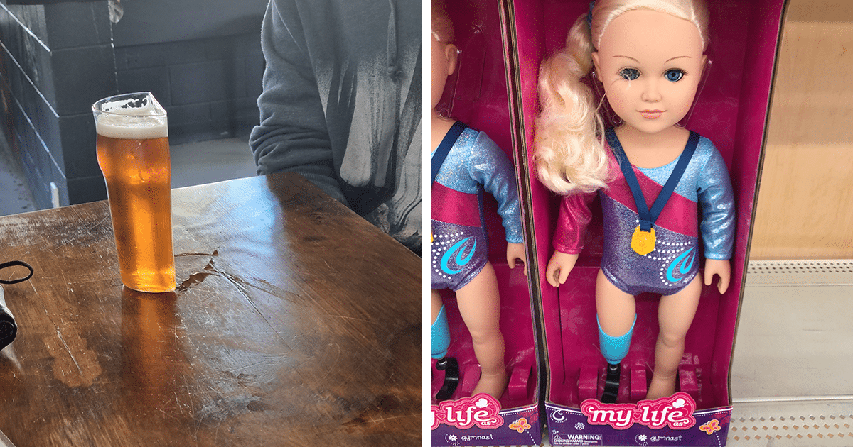
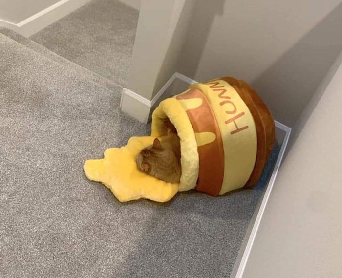
#2 I’m Lovin’ It
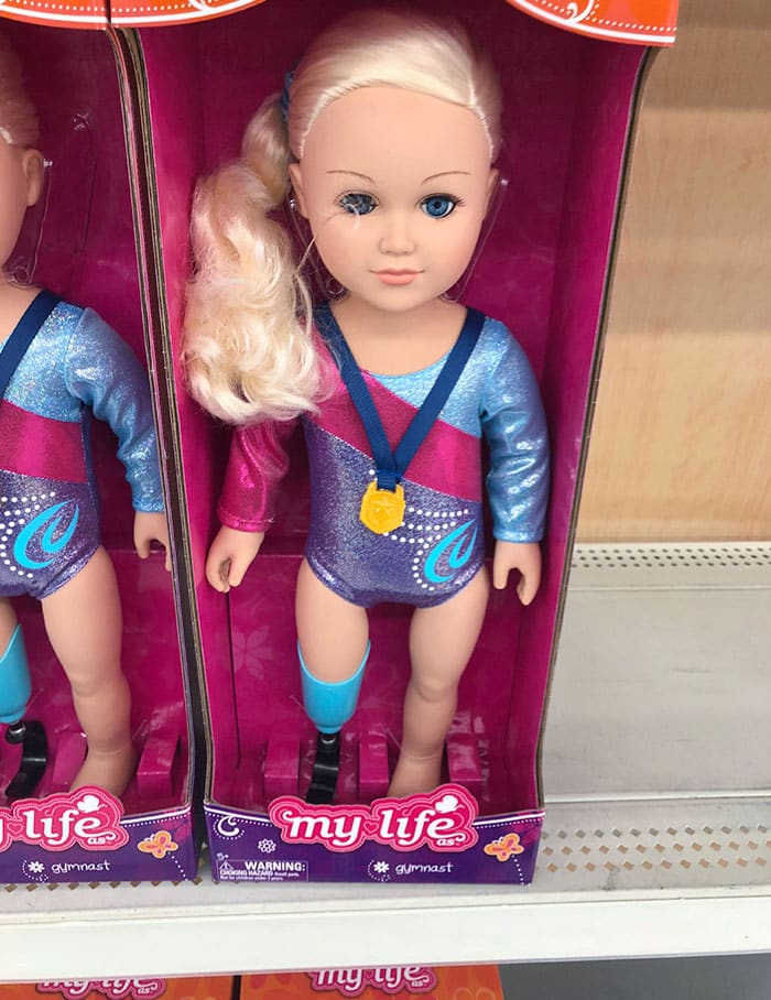
#3 An Amputee Doll
“But sometimes I’ll get the urge to create something obscure that I know no corporate partner will care for, and only a tiny portion of the population will appreciate, but will make me happy. So if I’ve got the energy, I’ll go for it. And not shockingly, it is a lot easier to find the energy for these types of works! I often end up surprised by the response to the ‘one for me’ pies, however. Maybe because they are made with a little more care and love, but oftentimes people will like those just as much as my more ‘mainstream’ offerings, even if they aren’t familiar with the subject matter,” she said that the audience can always surprise you with what they end up liking.
“I wonder if folks can guess which of my pies fall into the ‘one for me’ category?” she mused.
Though a lot of designers, artists, and creatives frequently encounter creative roadblocks, Jessica is one of the lucky few who never really had to deal with them (and we might be a bit jealous!). “I have sketchbooks filled with hundreds more Pie Art concepts than I could ever make in ten lifetimes… And there is so much creative inspiration out there in the world! All I have to do is look at craftspeople at the top of their game in a couple of different areas—watchmakers, architects, gardeners, painters, poets, etc.—and my mind is filled to the top with new ideas again,” she shared that we can look to nearly any area in life for inspiration.
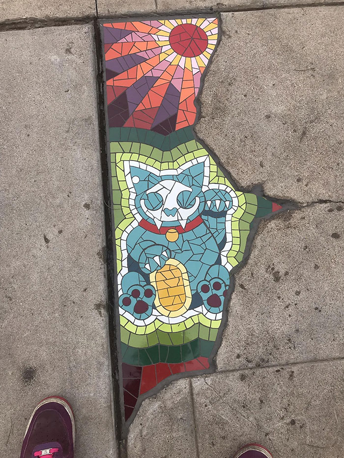
#4 This Crack In The Pavement Filled With A Stained Glass Cat Portrait
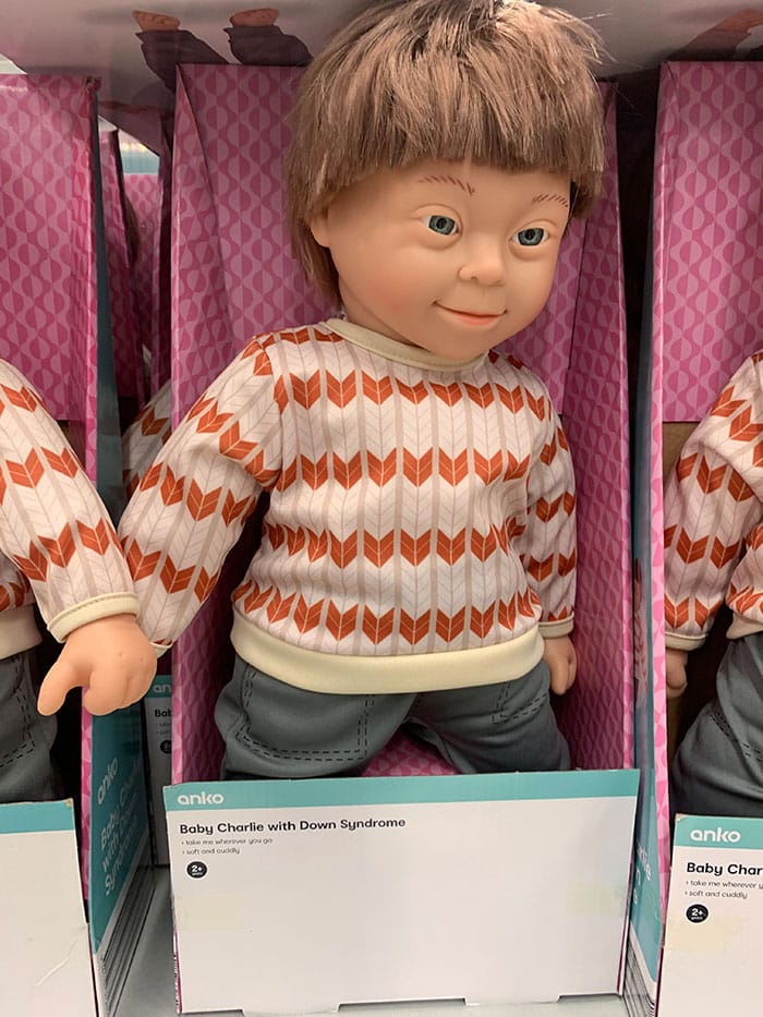
#5 Local Kmart Has A Doll With Down’s Syndrome
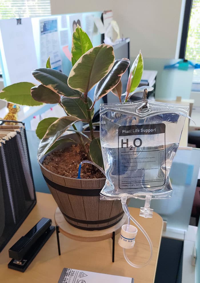
#6 IV Bag Plant Watering Thing I Saw At My Dr’s Office
“The biggest challenge to my work is not the ‘creativity tank,’ it’s the ‘energy/motivation’ tank. Professional artists who have to balance commercial realities against artistic passions I think all have to deal with finding ways to keep that ‘motivation tank’ topped up. It’s not always easy! But I find that being around other creative working professionals and talking with them about it helps a lot.”
Jessica explained to us that “it is critical” to plan out every last detail in advance when it comes to Pie Art. “Once your dough is rolled out, the clock is ticking! If you allow the fat in your dough to melt, you’ll lose the little pockets of air in the finished pie dough that creates that delicious flaky mouth-feel, and you’ll end up with tough leathery crust instead,” she explained why exactly time is so important. When it comes to turning her latest project into reality, every minute counts and the race against time is on.
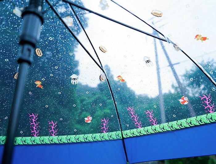
#7 Sometimes A Rainy Day Ain’t That Bad
#8 When I Bought My House, The Title Company Gave Me A Digital Copy Of All My Documents On A Thumb Drive Shaped Like A House Key

#9 The Room Number For Mammogram Testing

“To circumvent this, I fully sketch out my designs in advance and create paper or acetate templates to help me cut out pieces as fast as humanly possible. I even take things a step further and walk through the whole process in my mind before I take the dough out to the fridge. Visualizing the process this way allows me to spot any steps I may have missed—like a tool I’ve forgotten to set out, or the fact that I’ll probably want tea while I’m working and should put the kettle on now—which saves precious minutes of working time.”
However, she noted that things can still “go sideways from time to time.” Nobody’s perfect and mistakes sometimes happen even to the best of the best. These mistakes, however, help push the boundaries of what’s possible. “Less often these days, but when I am working with a new technique or unfamiliar dough, there is always the possibility that I will suddenly find myself needing to get creative to solve a problem on the fly. Sometimes, these last-minute saves end up becoming ‘proper Pie Art technique cannon’ down the road! ‘Happy Accidents’ are real.”
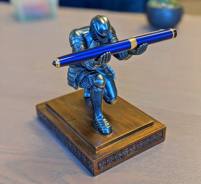
#10 The Pen Is Mightier Than The Sword
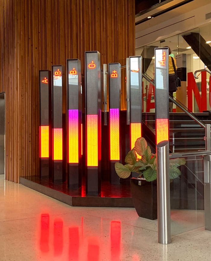
#11 The Local Blood Bank Has These Signs To Show How Much Blood They Have
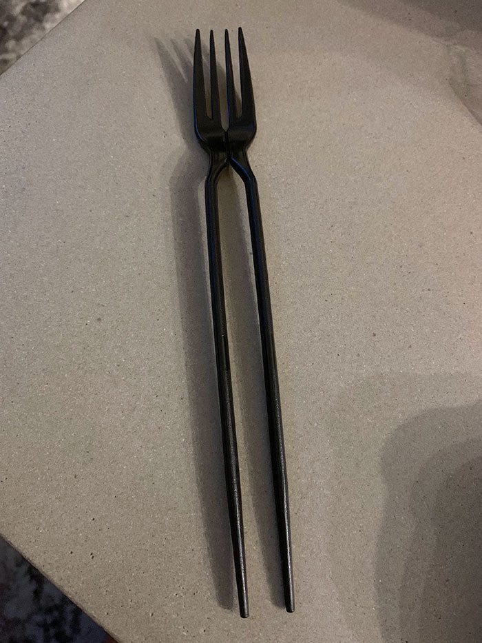
#12 My Thai Food Came With A Chork
Associate Professor of Design Studies Tim Antoniuk, from the University of Alberta, previously shared with us his take on design, including his opinion on Dieter Rams’ legendary 10 principles of good design.
He believes that Rams “does a great job” identifying what makes a design good. However, the principles themselves might not stand the test of time as well as could be hoped.
“That said, given the speed of change that we encounter today in our lives in the digital environment that we live in, I believe that some great design is not necessarily timeless. One example is seen in Interface Design, Ux Design, and in-service design. As new layers get added into our lives, things naturally have an evolutionary cycle,” Tim explained.
“This is different from furniture which naturally can be more ubiquitous and designed to fit the human body. There is a great deal of fuzziness in this discussion but I do believe that the essence of this idea is true,” he mused.
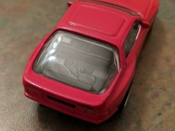
#13 The Porsche 944 Hot Wheel Designer Had Cancer, The Stethoscope Was Added By Ryu To Pay Tribute To His Cancer Doctor, Who Drove A 944. Rest In Peace Ryu Asada
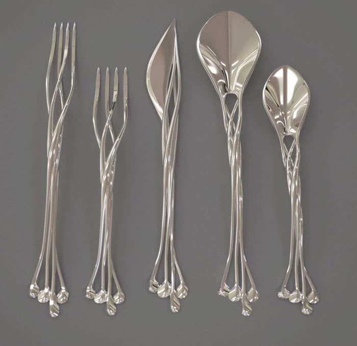
#14 Elvish – Elvin Silverware

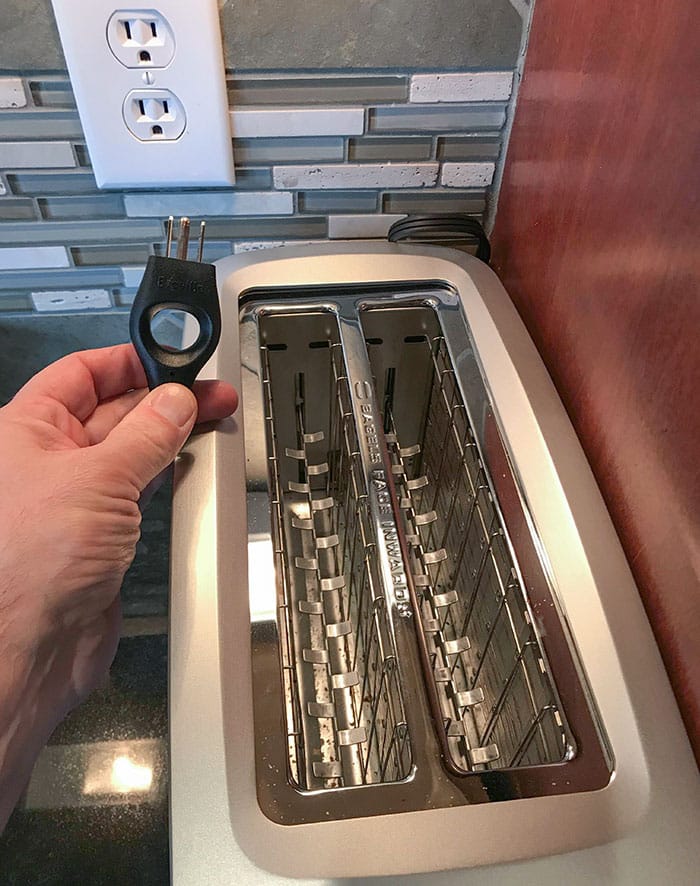
#15 This Toaster’s Cord Has Finger Pull
According to the design expert, someone’s personal taste creates a gray area between designs that are objectively good or bad.
“The gray area comes in when people start to talk about taste and about degrees of aesthetic. I may love the design of Bauhaus furniture, for example, while somebody may feel that it is too cold and void of personality. Not unlike great art, I believe that much of what came from this era is ‘great design,’ in part because it represents an era and a philosophy. When we start to mix in discussions of taste and preference, that is where the gray areas of good and bad design get blurred.”
In the expert’s opinion, we can intuitively feel if a design is good. “Quite often, this relates to ergonomics and the usability or functionality of the products and services and systems. Having said that, I think far too many people expect poor design that doesn’t really work well,” Tim told us.
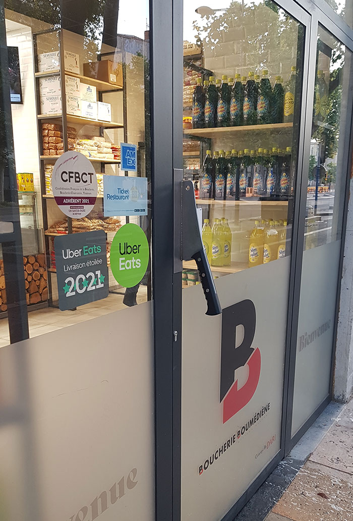
#16 This Doorknoob At My Butcher’s
#17 This Hourglass-Shaped Traffic Light

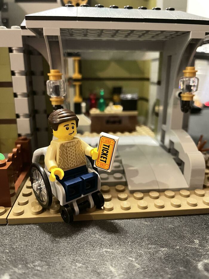
#18 LEGO Set Included This Figure/Wheelchair And Incorporates A Wheelchair Access Ramp Into The Build

The upside is that good design is a skill that can be learned. Through practice and exposure to quality. And lots of it. “For me, great design is what Dieter [Rams] talks about—it is also intuitive, it is deeply sympathetic and empathetic to the user at all levels, and at some level, it is emotional. It is a catalyst for giving us feelings.”
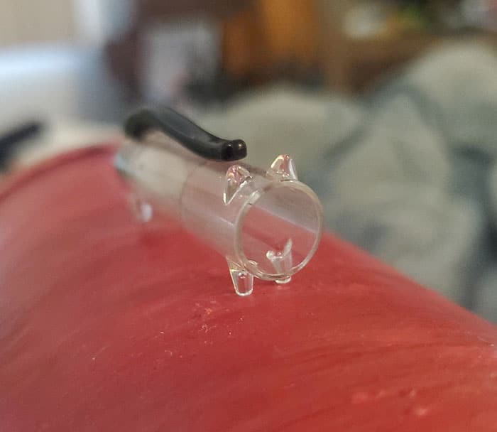
#19 I Found A Pen And The Pen Cap Is Shaped Like A Cat
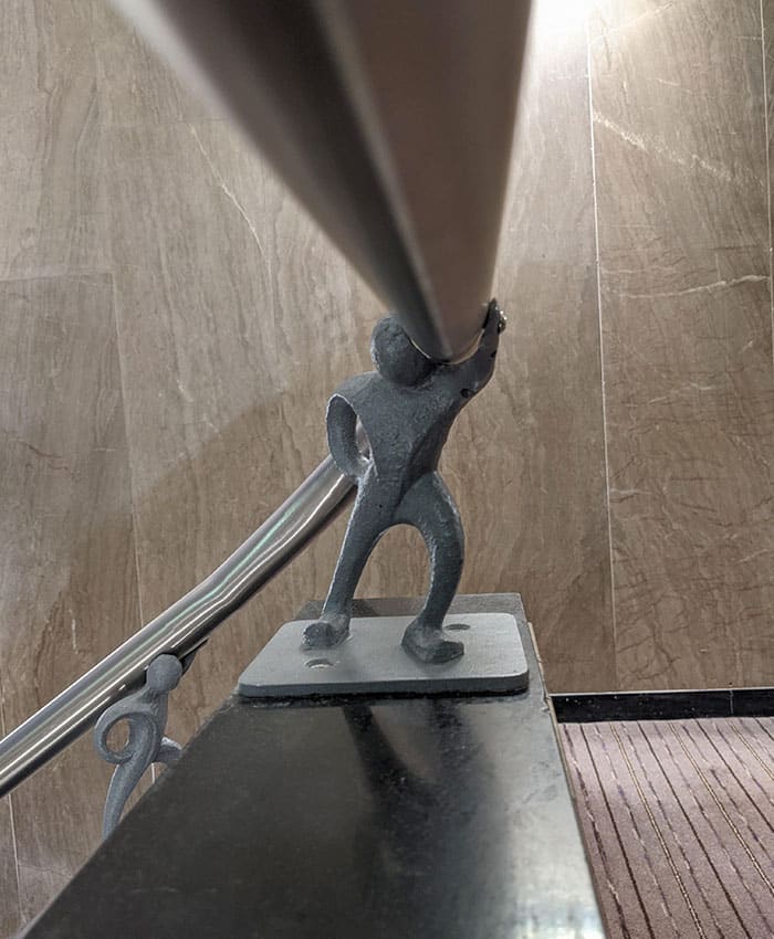
#20 The Banisters At My Hotel Were Held Up By Little Metal Men
#21 This Airplane Was Designed To Look Like A Whale

Some time ago, pie artist and all-around creative Jessica spoke to us about people’s sense of taste and aesthetics.
“Our sense of taste is a product of our upbringing and the people and content we are exposed to throughout our life, particularly during our formative years,” she explained to us.
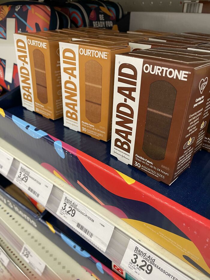
#22 Found Band-Aids For Different Skin Tones At Target
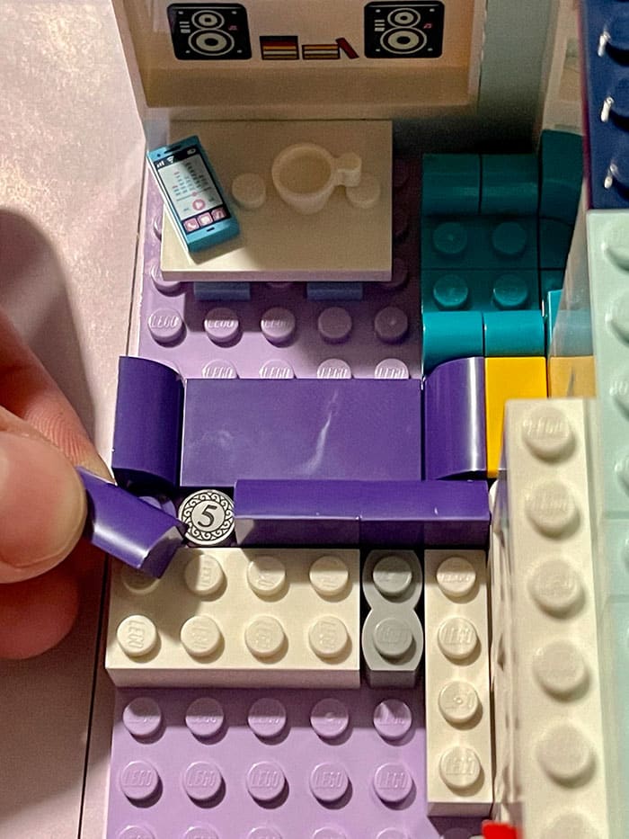
#23 This LEGO Set Has A Loose Change In The Couch
#24 The Benches At My Local Library Are Books

“Different cultures, different families, different peer groups place different value on different aesthetic conventions. If we want to ‘fit in’ with whatever group we are affiliating with, we tend to morph our own personal tastes to match that of the group,” Jessica said that we adapt to our social environments.
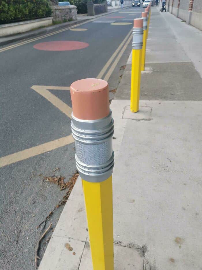
#25 Pencil Bollards Outside A School In London
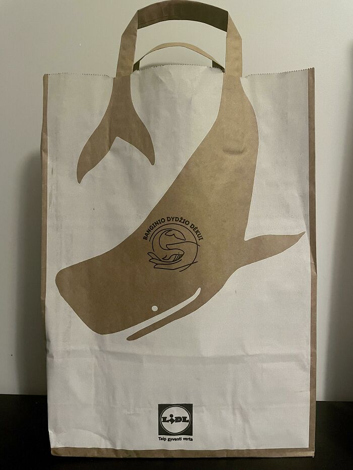
#26 This Lidl Lithuania Grocery Bag Promoting Paper Bags Over Plastic Ones
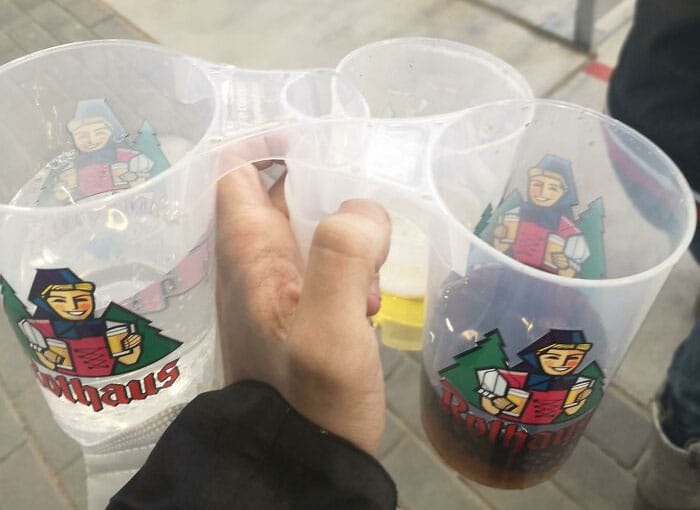
#27 These Cups/Glasses In The Freiburg Football Stadium Have Hollow Handles, You Can Carry Up To Four In A Single Hand
“But what if we don’t want to ‘fit in’ and conform our taste to match the crowd? Well, that’s where things get interesting,” the artist noted that this leads to interesting growth.
“Once a person has, for whatever reason, decided to expand their horizons beyond what is naturally presented to them in their immediate circles then something magical happens: their true ‘personal taste’ begins to coalesce,” she said.
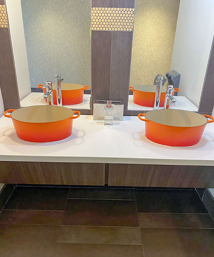
#28 The Sinks Inside The Le Creuset Headquarters Are Dutch Ovens
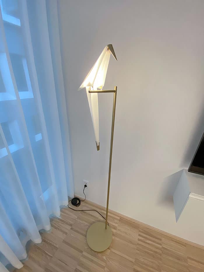
#29 Origami Bird Lamp
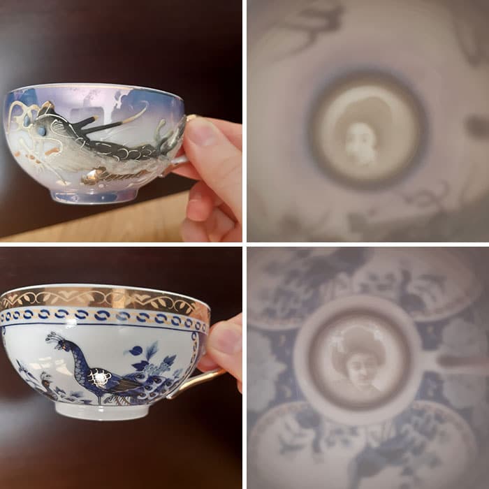
#30 My Grandma’s Chinese Teacups Where You Can See A Woman’s Face When You Put Them Against The Light (From 2 Different Sets)
“We may be born into a family/community that places a high value on exploring different aesthetic forms and embarking on journeys of personal discovery. We may be born into a family/community that punishes any deviation beyond the accepted norms,” Jessica told us.
“But we always have the choice to learn about something new. The taste may always be somewhat subjective, but the more forms of aesthetic content we seek out and allow ourselves to be exposed to, the better our shot at claiming that elusive, ‘good taste’ badge!”
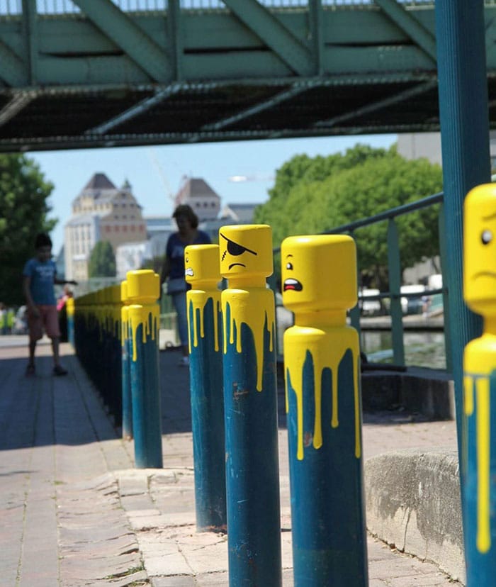
#31 Legos Inspired Bollards
#32 Thought This Was A Very Clever Way To Make A Caution Sign. It’s Still Highly Visible And Does It’s Job But With Some Fun
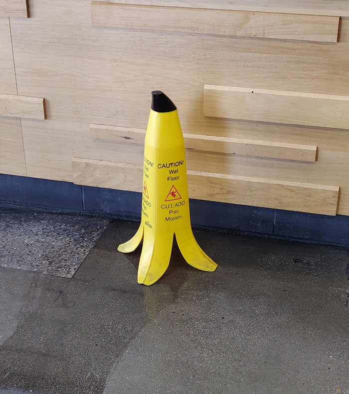
As an added bonus it was in a Jamba Juice so it makes sense with their aesthetic.
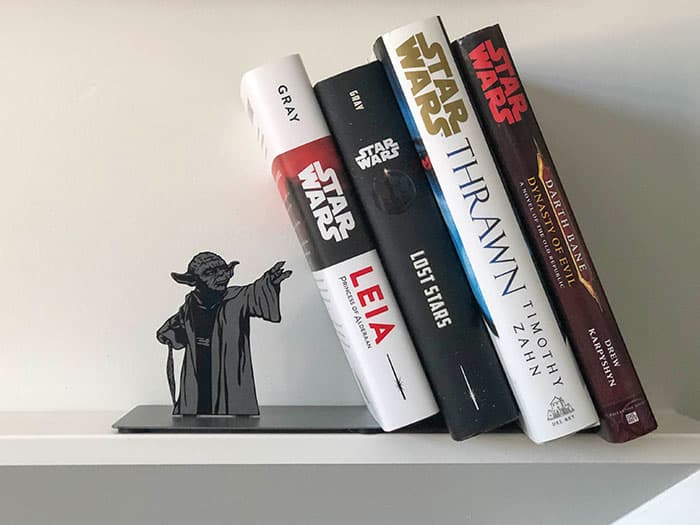
#33 The Force Is Strong With My Yoda Book End
#34 This Tesla Charger Set Up To Look Like A Vintage Gas Pump

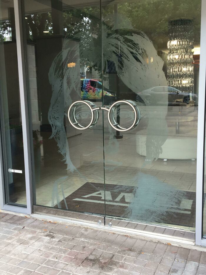
#35 Door Handle As John Lennon’s Glasses
