Do you know why a brand logo matters? Well, it’s because a logo can make or break a brand’s image. Since the logo grabs attention, it is memorable, and gives your company a separate identity; you should only choose the best design.
While there are some iconic logos from Apple to Nike, there are some logos that need to be fixed right now! Hopefully, an Italian graphic designer Emanuele Abrate is fixing some of the worst logos. For this project, he has picked 9 terrible logos that are degrading the company’s image.
“I had the idea of redesigning the worst logos ever for a long time. I’ve been coming across the articles about logos with unclear messages from all over the world for several years (one of these articles I think I read on Bored Panda,)” he told us.
Scroll down to see his work.
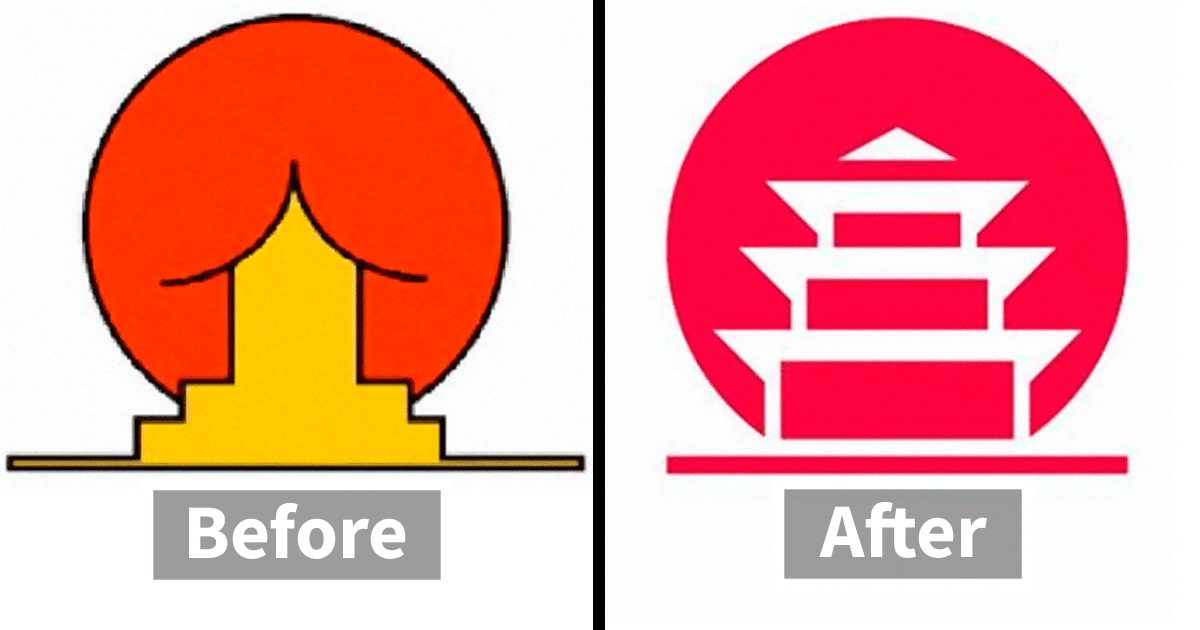
Instituto de Estudos Orientais
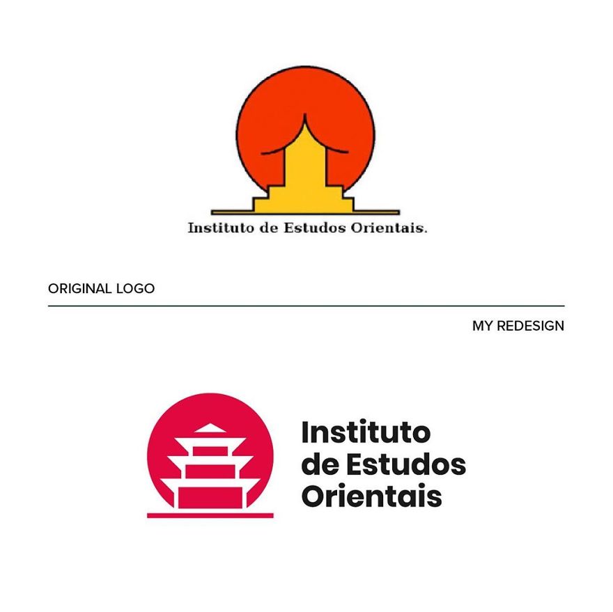
“I wanted to keep the concept unchanged, working on the negative space and enhancing the figure of the pagoda,” he says.
“I was trying to figure out how I would approach them if they were really commissioned to me.” He further adds “that manage to indelibly enter people’s minds through simplicity and that manage to create an effective and coherent visual ecosystem with the brand they represent.”
Kudawara Pharmacy
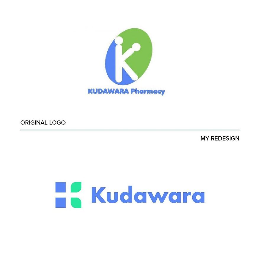
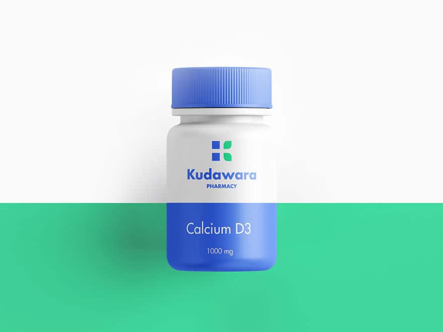

He names a couple of them: “a poor use of typography, disproportionate elements, and the defective use of shapes that create an ambiguous message.” He said, “I used simple shapes to build the letter K and give a sense of trust linked to nature.” Plus, “In the negative space you can also see a cross (a distinctive element in the pharmaceutical field).”
Fire Prevention Products
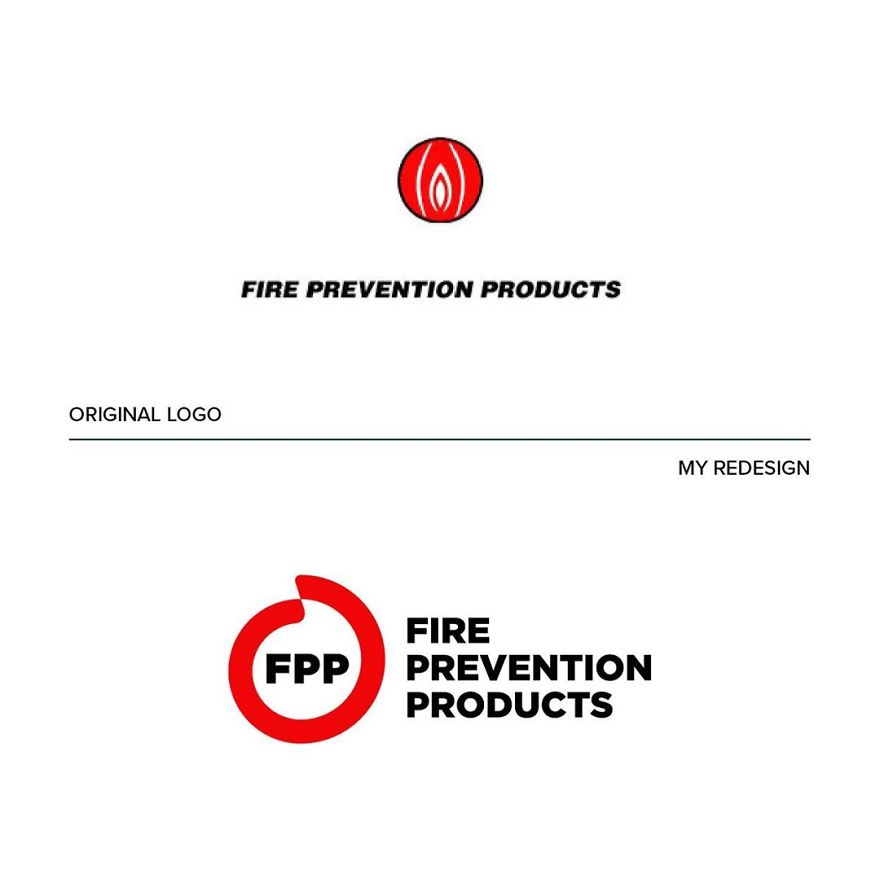
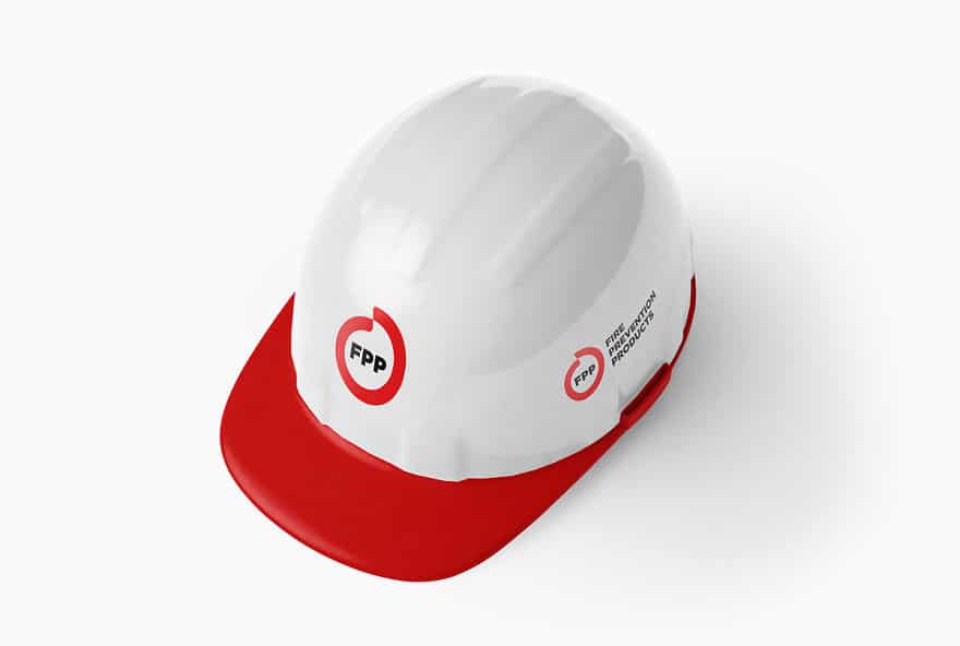
“This logo suggests that something ‘down there is on fire, uh là là!” joked the Italian designer. Of course, it doesn’t hold the sense of safety one would expect. That’s why I decided to develop a new concept starting from circular shapes that enclose the figure of a flame in the negative space.”
He says he is “a big fan of the work of Chermayeff & Geismar & Haviv and I fully agree with their philosophy” because “their logo design projects are the ones that best resist the ‘test of time.’” A good logo should also always “have an interesting concept and be in line with the company identity which it represents,” he commented.
Mama’s Baking
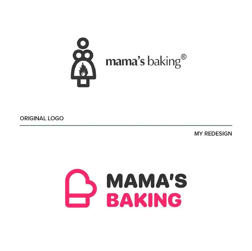
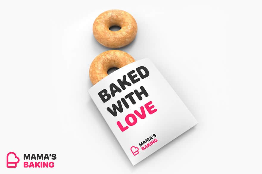
The idea was inspired by “the figure of the mother who cooks with passion.” Imagine her taking the hot pan out of the oven. “I started from the oven mitt as an iconic symbol, and tied it with a heart for the message of love and passion.”
The Computer Doctors
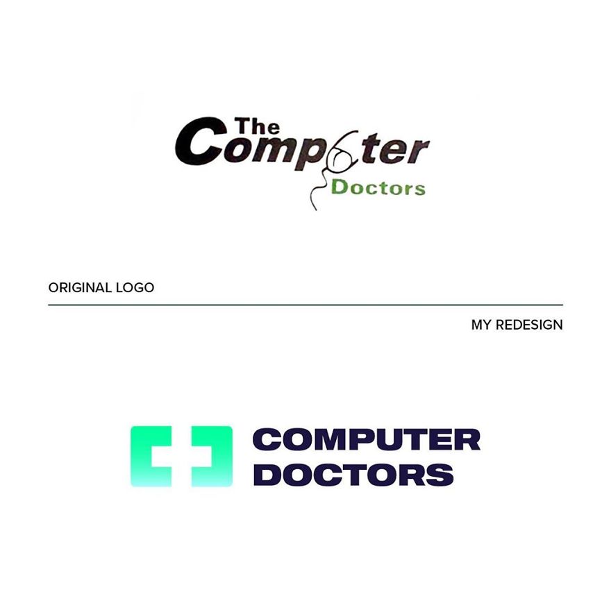

“The idea behind the new logo was to start from the shape of a monitor to insert across in the negative space and at the same time enhance the initial letters C and D,” he explained.
Clinica Dental San Marcelino
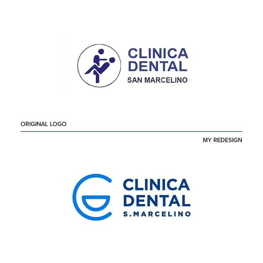
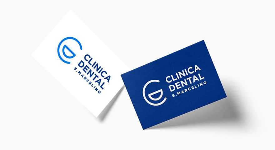
“A dentist or a seducer?” That’s what came to Emanuele’s mind when he saw this one. “The logo is so unclear that I came up with a simpler and less descriptive solution”. “The clean, rounded lines and the blue color are intended to convey a sense of confidence and cleanliness,” he commented.
In fact, “the idea for this page was inspired by the success of my project on Behance.”
OGC (Office of Government Commerce)
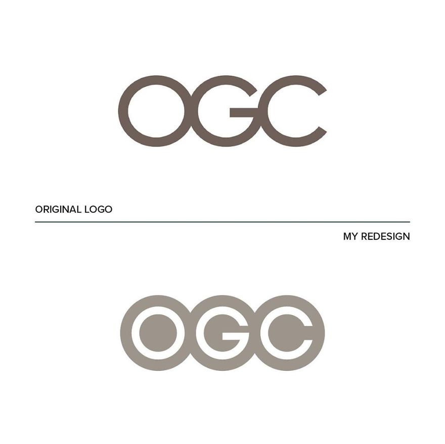
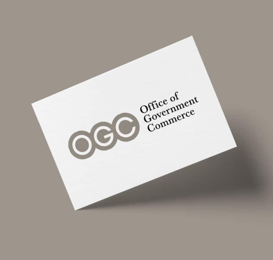
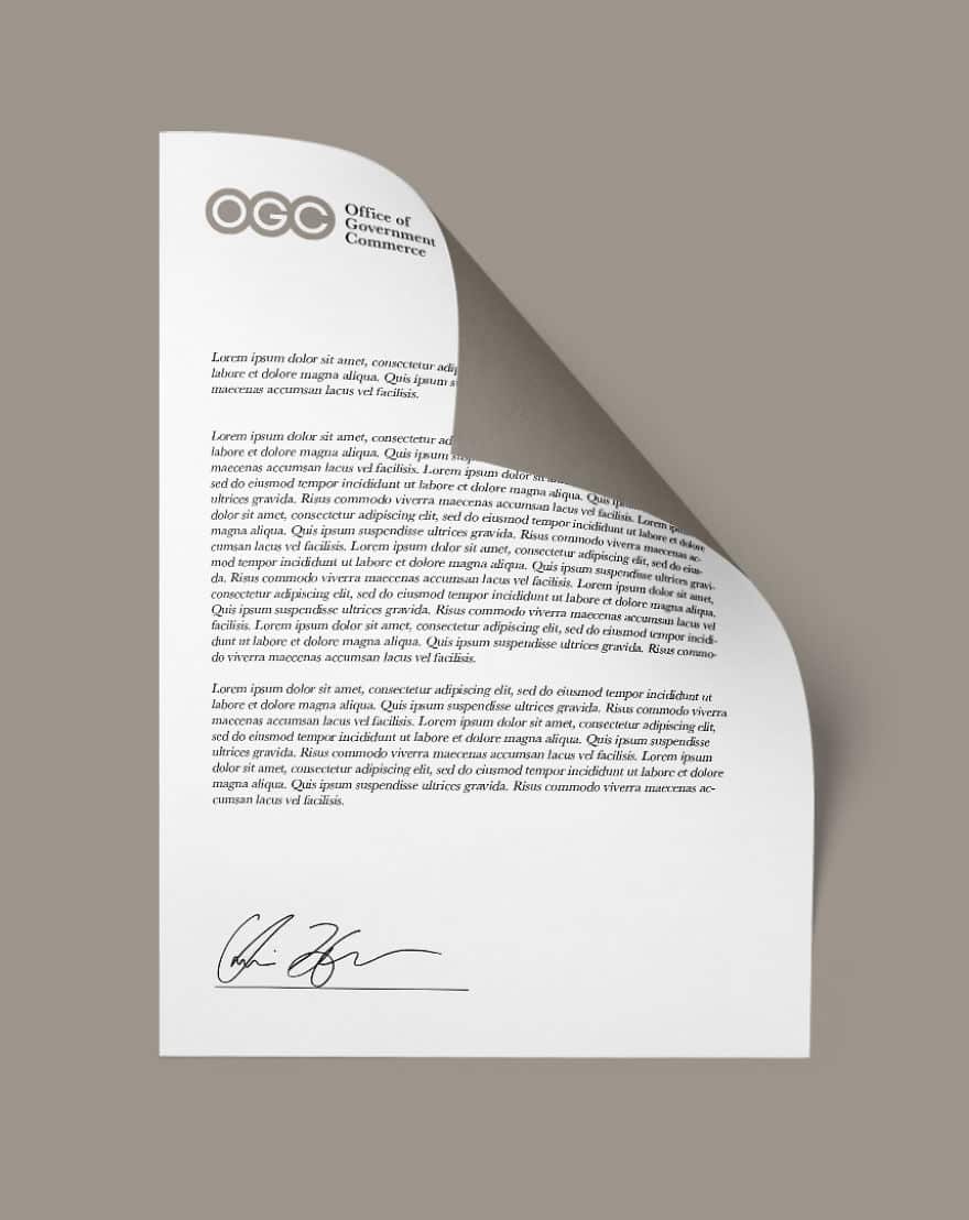
“But by rotating the logo, you can see a rather embarrassing figure (definitely not a good move for a government agency),” explains Emanuele.
Safe Place
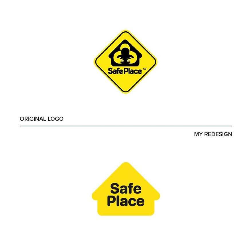

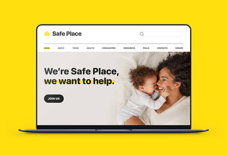
“It’s all shapes inside shapes inside other shapes.” Emanuele rolled up his sleeves: “Ok, let’s do some tidying up, let’s take away everything that is superfluous: the house is the only really evocative element of this logo and so, let’s enhance it!”
Arlington Pediatric Center
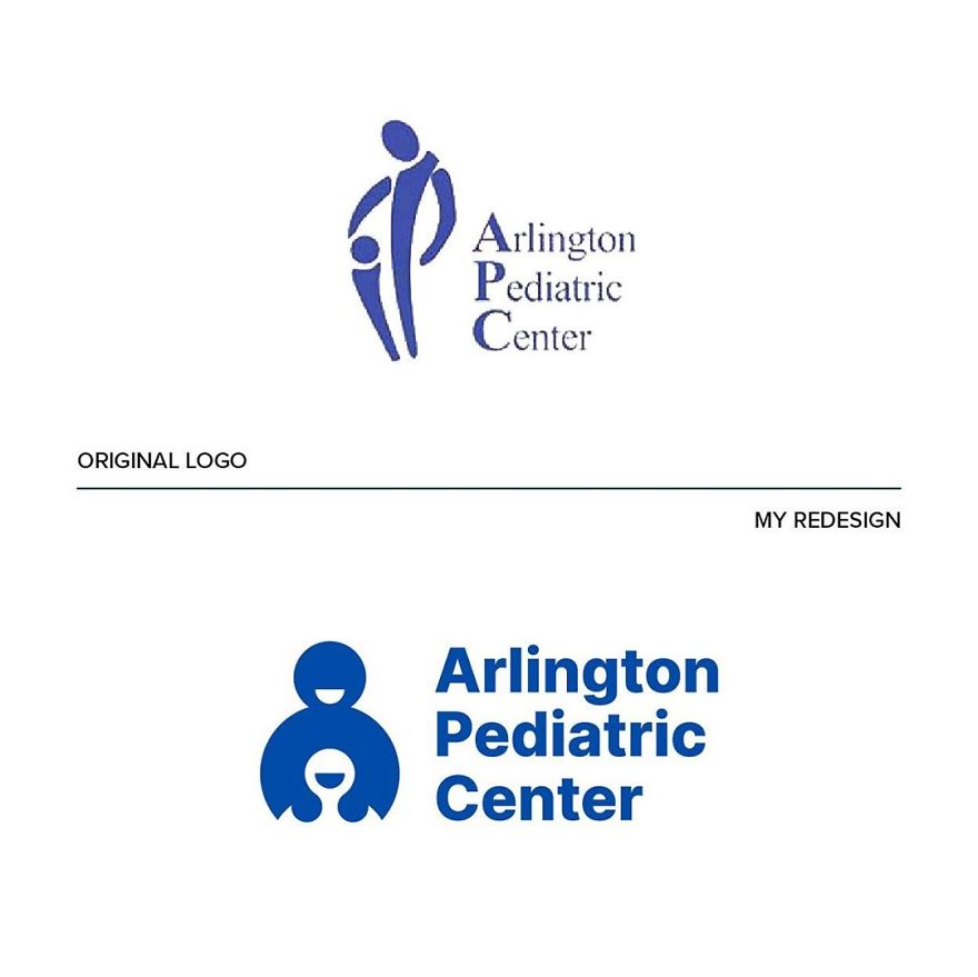
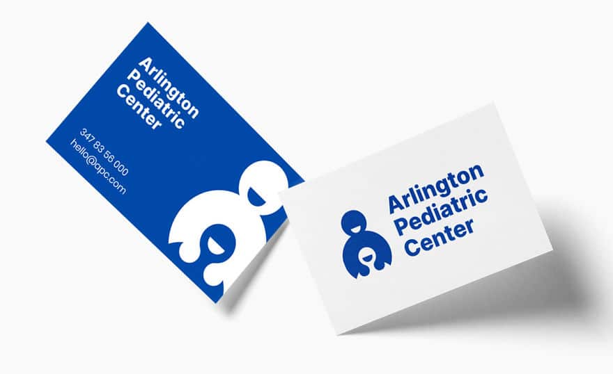
“The simple and circular shapes make the pictogram friendly and warm. I also replaced the typography with more modern but still institutional sans serif.”


