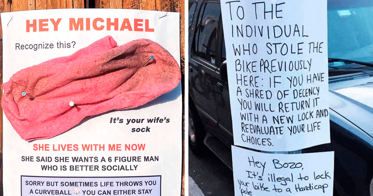
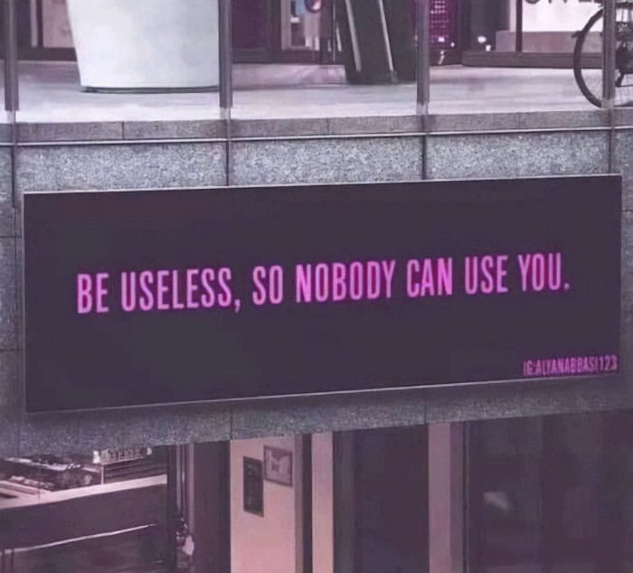
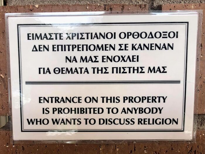
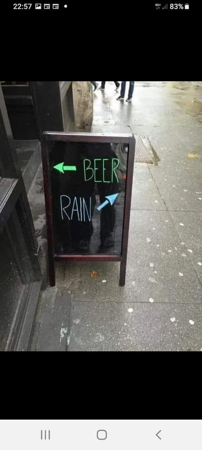
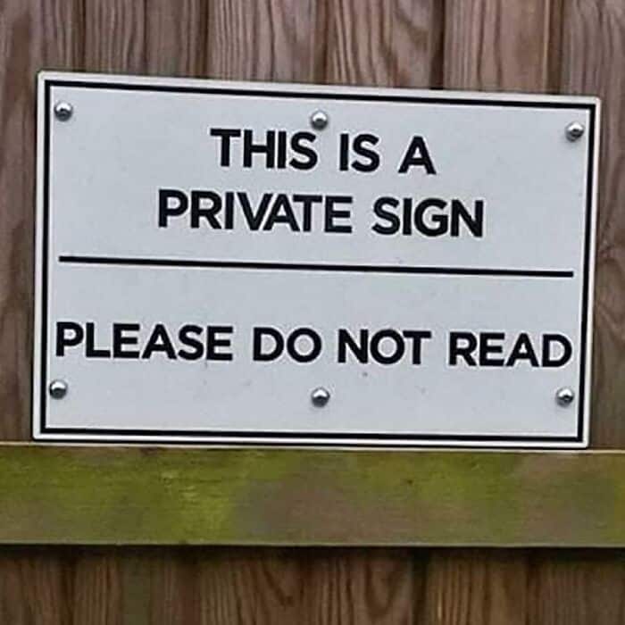
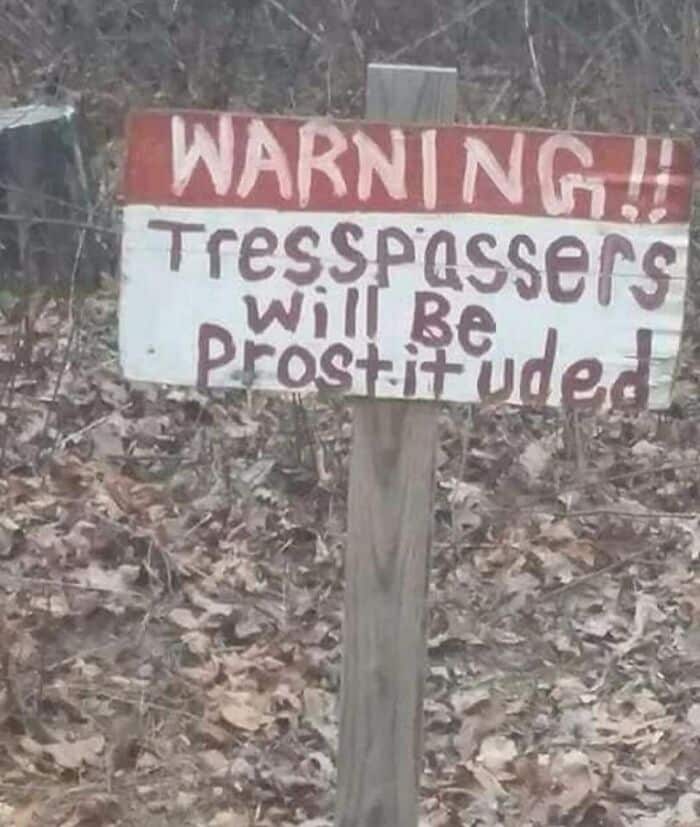
The Absurd Sign Project is a Facebook group with members sharing funny signs they can find.
We’re talking brutal spelling mistakes. The good stuff. Let’s take a look at some of the most popular posts on the group.
1.
2.

One of the group’s admins, Craig Hey, was kind enough to tell us more about this amusing corner of the internet.
“The community is fantastic,” Craig told.
The Absurd Sign Project had 166,000 members before Facebook banned it. Content isn’t the most important thing when it comes to numbers.
3.
4.
5.
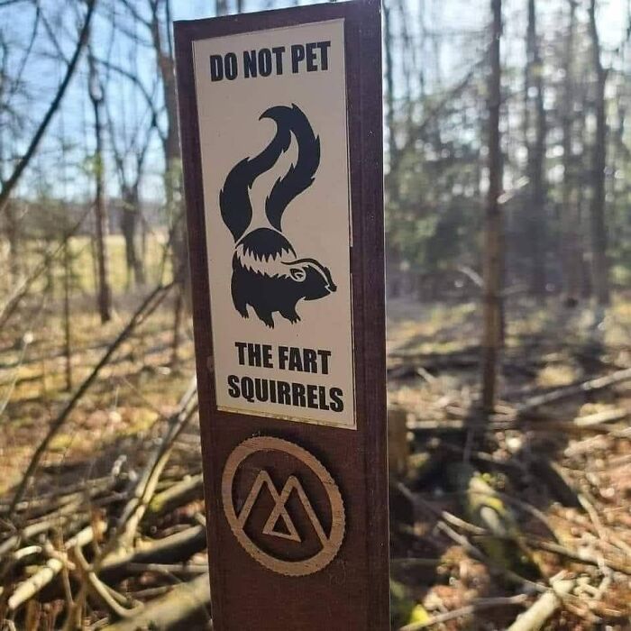
Craig said that bigger Facebook groups don’t have a problem with toxic users who want to litter all over them.
“Sometimes we have to take down a post we think Facebook won’t like, but we don’t get too many trolls. We have a dedicated admin and mod team who love seeing the group thrive and grow. Our most common issue is people not being happy over the posts we have to take down so we don’t get shut down.”
6.
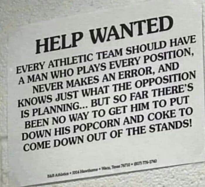
7.
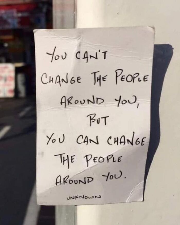
8.

9.
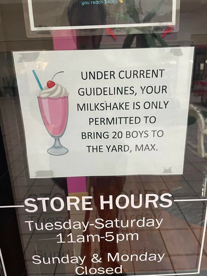
The signs that get featured on the group come from a variety of places, but there are a few leaders.
“The biggest provider of entertainment, I would say, are restaurants and supermarkets,” Craig said.
The representative of ‘The Absurd Sign Project’ thinks the main reason why there are so many funny signs is not incompetence. We want to make each other laugh.
10.
11.
12.
13.
“We are the biggest absurd sign group I’ve found and we are the original group,” Craig added.
“If anyone has any absurd signs of their own and wants to share, we would love to keep growing as a community and we want to see them!”
14.
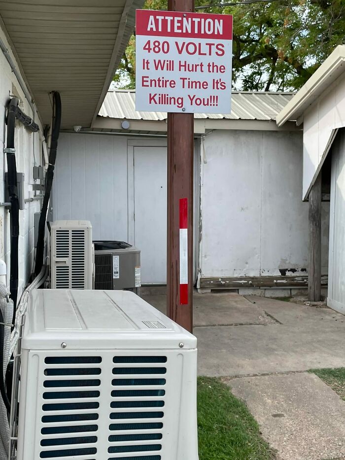
15.
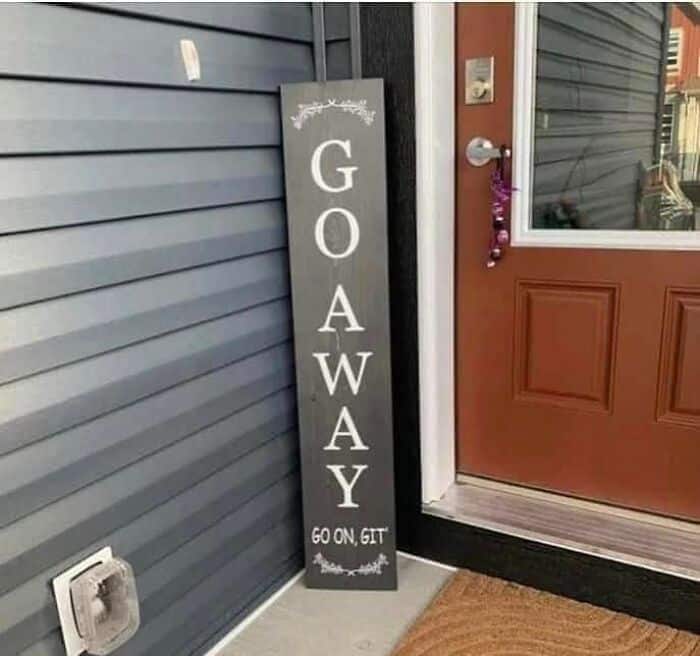
16.
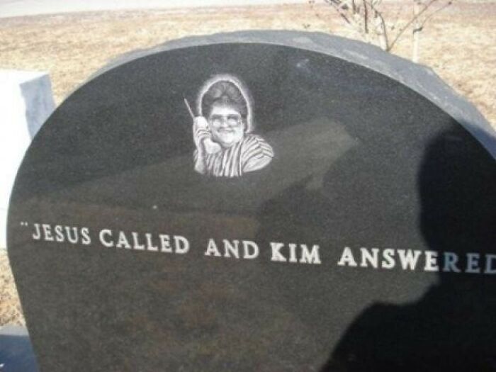
17.
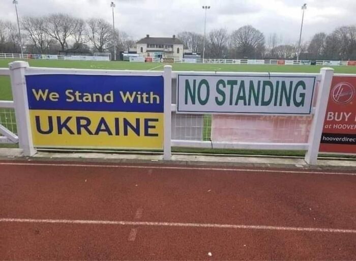
If you have to make a sign for your business or your child’s lemonade stand, it might be worth remembering a chat with Adrian Geach about funny and clever signs.
Geach, who has been a signwriter since 1980, told that “a good sign should be eye-catching, easy to understand and not too wordy with enough negative space around the text or logo, and have a good color scheme.”
18.

19.
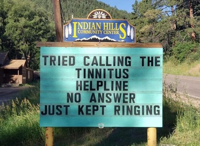
20.
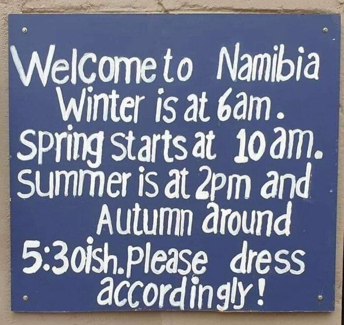
21.
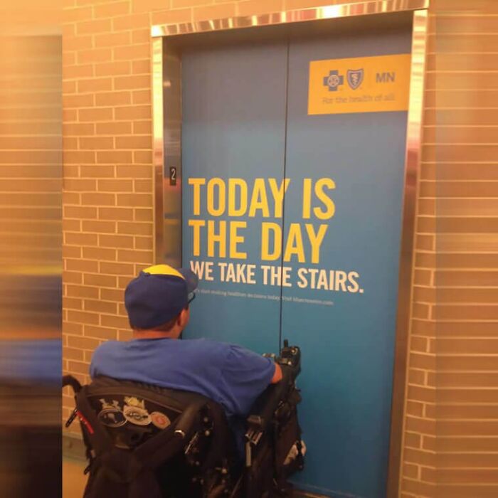
Geach has been involved in all areas of graphics and signwriting for decades, but not that long ago, he went back to his roots and focused on traditional signwriting.
With the current resurgence of interest in signwriting and hand-rendered work, he utilizes his skills to offer clients a more personal, unique, and organic solution using old-fashioned materials and techniques.
“A sign might only be looked at for a few seconds so it needs to leave an impression within this time frame, hence the less is more approach,” he said.
22.

23.
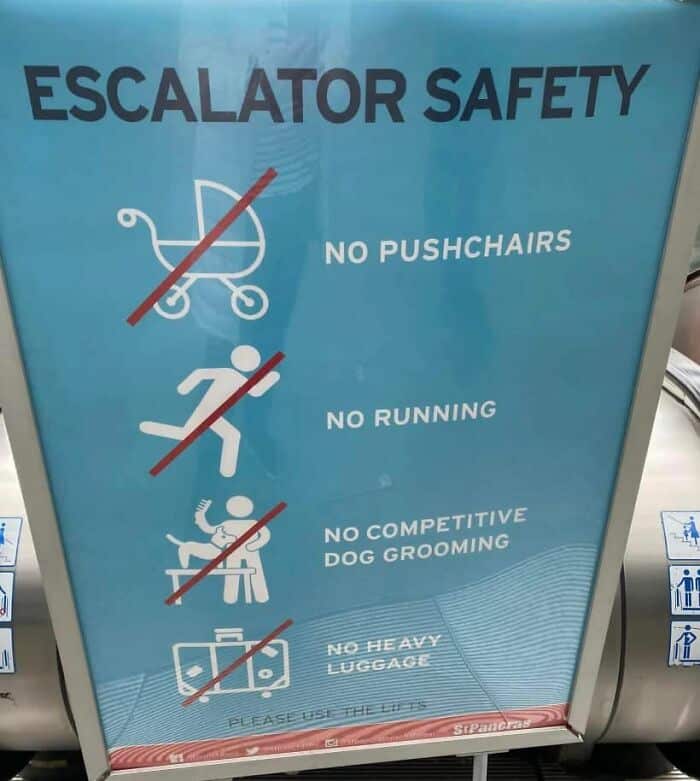
24.
25.

“There are many factors to take into account when designing a sign, but the most important thing is to make sure it doesn’t get lost in its surroundings,” Geach revealed.
“A bad sign is too much lettering, not enough space around or in-between text and logos, and bad color choices.”
We’ll become experts on our own after seeing a few more posts on ‘The Absurd Sign Project’.
26.
27.
28.
29.
30.


