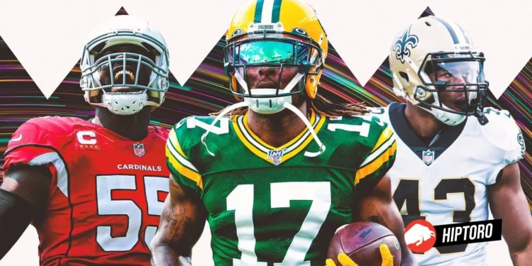
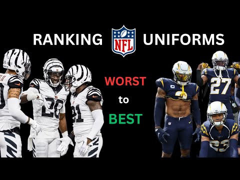
The evolution of NFL uniforms is a tapestry woven with threads of nostalgia, innovation, and occasionally, questionable fashion decisions. As the league has grown, so too has the attention to the aesthetics of the game, not just for branding but as an essential part of the team’s identity.
The transformation of uniforms over the years reflects a fascinating journey from simple designs to intricate patterns that sometimes delight and, other times, bemuse the fans. Let’s delve into the highs and lows of NFL team uniforms, celebrating the classics and scrutinizing the not-so-great decisions that have sparked debates among fans and fashion critics alike.
Celebrating the Classics, When Teams Got It Right
The Arizona Cardinals Take Flight
In the late ’80s and early ’90s, the Arizona Cardinals embraced their new home by incorporating the Arizona state flag into their away uniforms. This nod to their new roots, combined with a clean and impactful design, marked their best look during a period of otherwise basic fashion choices.
Atlanta Falcons Soar in Red and Gray
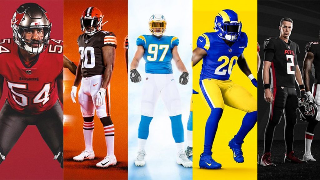
The Atlanta Falcons’ red-on-gray ensemble from the late ’80s stands out as a sartorial highlight, despite the team’s struggles on the field. The vibrant red paired with the sleek gray pants and the underrated helmet design represents a missed opportunity for a look that hasn’t seen the light of day since 1989.
Baltimore Ravens’ Purple Majesty
The Baltimore Ravens’ color rush ensemble introduced in 2016 showcases the power of purple when done right. The addition of gold accents elevated the uniform, making it not just a fan favorite but a symbol of the team’s vibrant identity during Lamar Jackson’s MVP era.
Fashion Faux Pas, When NFL Teams Missed the Mark
The Arizona Cardinals’ Misstep
In contrast to their earlier successes, the Arizona Cardinals 2005-2022 away uniform represented a departure from tradition that didn’t pay off. The white-on-white design with random red accents did little to enhance the team’s visual appeal on the field.
Atlanta Falcons’ Clumsy Flight
The Atlanta Falcons 2003-19 away uniforms exemplify a complicated design that fails to capture the team’s spirit or colors effectively. The introduction of a new concept in 2003 left fans longing for the simplicity and elegance of earlier designs.
Looking back at the best and worst uniform looks for every NFL team via @SRobinson25 @yardbarker @nfl #football #nflhttps://t.co/g9Zw3wJOIk pic.twitter.com/6jnECLBjqv
— Reverend Paul Revere (@RevPaulRevere) May 11, 2023
A Baltimore Raven’s Rare Blunder
The Baltimore Ravens’ 1996 home uniforms, with their bulky numbers and mismatched purple jerseys, were quickly recognized as a misstep. The team wisely moved towards a more cohesive design the following year, leaving the initial attempt firmly in the past.
NFL Uniforms, Evolution of Style
The NFL’s uniform history is a rich tapestry that reveals much about the league’s evolution and the changing tastes of its fans. While some designs have become iconic, symbolizing the teams’ glory days, others serve as cautionary tales of fashion experiments gone awry. As the league continues to evolve, so too will its approach to uniform design, always seeking the perfect balance between tradition, innovation, and, of course, style.
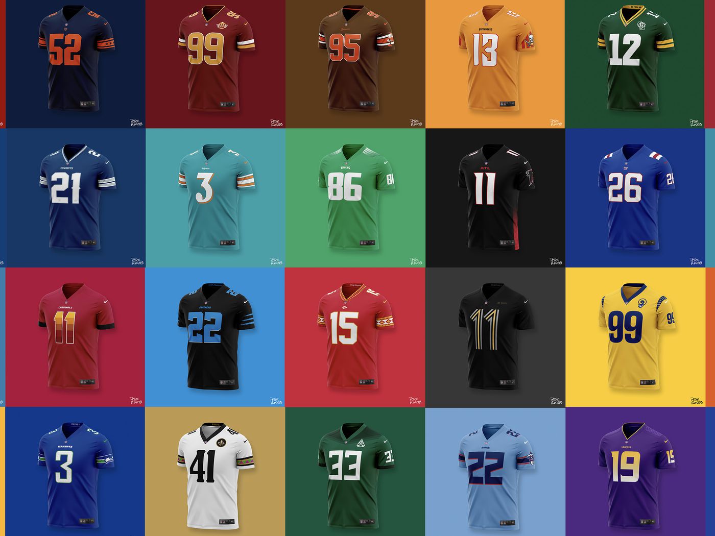
This journey through the best and worst of NFL uniforms is more than just a critique; it’s a celebration of the league’s visual history and its ongoing quest to blend performance with aesthetics. Whether in the roaring cheers of a stadium or the quiet nostalgia of a fan’s memorabilia room, these uniforms continue to tell the stories of triumphs, trials, and the timeless spirit of the game.
Sources: Yardbarker


